

Toggles
The two widgets that switch a setting on or off: a Toggle, drawn as a row
whose value reads as one of two words, and an IconToggle, drawn as an icon
whose fill shows the state. Neither holds state. Each draws the state it is
given and hands the screen a message carrying the state it moves to, so a
screen assigns the value and never flips it.
The tutorial builds a screen around a Stepper and a
Toggle from nothing. How a control is driven
covers the focus and keys a toggle shares with a slider and a stepper. This
page is what each toggle does.
Topics
Section titled “Topics”Toggle | A boolean setting, drawn as a row whose value reads as one of two words. |
IconToggle | An icon whose fill shows a boolean, and whose tap flips it. |
Toggle
Section titled “Toggle”A boolean setting, drawn as a row whose value reads as one of two words.
pub struct Toggle<M>
A toggle is a row, not a switch. The theme draws no switch graphic. A
Toggle is a ListRow::toggle inside a
List of one, so it looks identical standing alone or beside
rows in a list, and it takes focus and draws its highlight the way a row does.

It hands update the state it is moving to. The message is built when the
toggle is, from the opposite of on, and the tree is rebuilt every frame, so
the next press always carries the next state. A screen assigns it and never
writes !self.frontlight. A message that only says "flip" means the opposite
thing if it is ever applied twice; one that says "on" does not.
| Builder | Sets | When not called |
|---|---|---|
on_change | the message, which makes the toggle a focus stop | a read-out, never focused |
To place the row in a list of your own instead, take it with
into_row.
Example — a toggle standing alone
use xpui::{NavigationScreen, Screen, Toggle, View};
#[derive(Clone, Copy)]enum Msg {  Frontlight(bool), // the state it moves to}
struct Display {  frontlight: bool,}
impl Screen for Display {  type Message = Msg;
  fn body(&self) -> impl View<Msg> {    NavigationScreen::new(      Toggle::new("Frontlight", self.frontlight, "On", "Off").on_change(Msg::Frontlight),    )  }
  fn update(&mut self, message: Msg) {    match message {      Msg::Frontlight(on) => self.frontlight = on,    }  }
  fn title(&self) -> Option<&'static str> {    Some("Display")  }}
Example — the message carries the next state
Confirm on a focused toggle sends what a tap sends. Pressed twice, it sends
true and then false, because each frame builds the message from the state
the screen now holds.
use xpui::screen::{Driver, Runtime};use xpui::{Button, NavigationScreen, Screen, Toggle, View, testing, vstack};
#[derive(Clone, Copy)]enum Msg {  Hyphenation(bool),  Justify(bool),}
struct Typesetting {  hyphenation: bool,  justify: bool,}
impl Screen for Typesetting {  type Message = Msg;
  fn body(&self) -> impl View<Msg> {    NavigationScreen::new(vstack![16;      Toggle::new("Hyphenation", self.hyphenation, "On", "Off").on_change(Msg::Hyphenation),      Toggle::new("Justify", self.justify, "On", "Off").on_change(Msg::Justify),    ])  }
  fn update(&mut self, message: Msg) {    match message {      Msg::Hyphenation(on) => self.hyphenation = on,      Msg::Justify(on) => self.justify = on,    }  }
  fn title(&self) -> Option<&'static str> {    Some("Typesetting")  }}
testing::install();testing::reset();let mut runtime = Runtime::new(Typesetting { hyphenation: false, justify: true });runtime.render();
testing::press(Button::Confirm); // focus starts on Hyphenationruntime.loop_();assert!(runtime.screen().hyphenation);
testing::press(Button::Confirm);runtime.loop_();assert!(!runtime.screen().hyphenation);assert!(runtime.screen().justify, "the other toggle was never touched");
Example — a toggle beside a list of ListRow::toggle rows
use xpui::{List, ListRow, NavigationScreen, Screen, Toggle, View, vstack};
#[derive(Clone, Copy)]enum Msg {  Frontlight(bool),  Hyphenation(bool),  Justify(bool),}
struct Reading {  frontlight: bool,  hyphenation: bool,  justify: bool,}
impl Screen for Reading {  type Message = Msg;
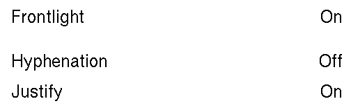
  fn body(&self) -> impl View<Msg> {    NavigationScreen::new(vstack![24;      // A view by itself: the next state is worked out for you.      Toggle::new("Frontlight", self.frontlight, "On", "Off").on_change(Msg::Frontlight),      // Rows in one list: each says its next state itself.      List::new()        .push(          ListRow::toggle("Hyphenation", self.hyphenation, "On", "Off")            .on_tap(Msg::Hyphenation(!self.hyphenation)),        )        .push(          ListRow::toggle("Justify", self.justify, "On", "Off")            .on_tap(Msg::Justify(!self.justify)),        ),    ])  }
  fn update(&mut self, message: Msg) {    match message {      Msg::Frontlight(on) => self.frontlight = on,      Msg::Hyphenation(on) => self.hyphenation = on,      Msg::Justify(on) => self.justify = on,    }  }
  fn title(&self) -> Option<&'static str> {    Some("Reading")  }}
The two draw the same row, and a focused one is highlighted the same way. What differs:
Toggle | ListRow::toggle | |
|---|---|---|
| Is | a view: a list of one row | a row, which only a List draws |
| The next state | worked out from on by on_change | written by the screen, !on, in on_tap |
| Several of them | separate lists, spaced by the stack around them | rows of one list, at the theme's row pitch |
| Use it | for a setting that stands on its own | for a setting among other rows |
Creating a toggle
Section titled “Creating a toggle”Toggle::new
Section titled “Toggle::new”A row labelled label, reading on_label or off_label for on.
pub fn new(label: impl Into<String>, on: bool, on_label: impl Into<String>, off_label: impl Into<String>) -> Self| Parameter | Meaning |
|---|---|
label | What the setting is called. |
on | Its current state. |
on_label | The value shown while on is true: "On", "Show". |
off_label | The value shown while it is false: "Off", "Hide". |
The caller supplies both words, because they differ from setting to setting and only the caller can translate them.
Responding to input
Section titled “Responding to input”Toggle::on_change
Section titled “Toggle::on_change”Sends make(next_state) when tapped or confirmed.
pub fn on_change(self, make: fn(bool) -> M) -> SelfThe framework flips the value, so the screen never writes !self.something.
The message is make(!on), built here, once.
Placing the row by hand
Section titled “Placing the row by hand”Toggle::into_row
Section titled “Toggle::into_row”Consumes the builder into the row, for putting several in one List.
pub fn into_row(self) -> Option<ListRow<M>>The row carries no message, so give it one with
ListRow::on_tap, and with it the next state. None
once on_change has taken the row.
use xpui::{List, Toggle};
#[derive(Clone, Copy)]enum Msg {  Justify(bool),}
let justify = true;let row = Toggle::<Msg>::new("Justify", justify, "On", "Off")  .into_row()  .expect("on_change has not taken it");assert_eq!(row.value_text(), Some("On"));let list: List<Msg> = List::new().push(row.on_tap(Msg::Justify(!justify)));
let taken = Toggle::new("Justify", justify, "On", "Off").on_change(Msg::Justify);assert!(taken.into_row().is_none());
See also: ListRow::toggle, IconToggle
IconToggle
Section titled “IconToggle”An icon whose fill shows a boolean, and whose tap flips it.
pub struct IconToggle<M>
Solid means on and outline means off. The glyph asks for 32 pixels and keeps whatever size the host draws, centred in a square the theme's minimum touch target wide, so two side by side each own a finger's worth of space. Which icon a number means is the host's to say; see images.
Touch only. An icon toggle is never a focus stop, so a panel meant for a
finger grows no stops that Up and Down must walk past. When the same action
should be reachable by key, map a key to it in Screen::on_key. Without
on_change it only draws.
Example — a frontlight button, also reachable by key
use xpui::{Button, IconRef, IconToggle, NavigationScreen, Screen, View};
/// What a backend publishes. The framework only ever sees the number.#[derive(Copy, Clone)]enum Glyph {  Sun = 0,}
impl From<Glyph> for IconRef {  fn from(glyph: Glyph) -> IconRef {    IconRef::new(glyph as u16)  }}
#[derive(Clone, Copy)]enum Msg {  Light(bool),}
struct Frontlight {  light: bool,}
impl Screen for Frontlight {  type Message = Msg;
  fn body(&self) -> impl View<Msg> {    NavigationScreen::new(IconToggle::new(Glyph::Sun, self.light).on_change(Msg::Light))  }
  fn update(&mut self, message: Msg) {    let Msg::Light(on) = message;    self.light = on;  }
  /// Nothing on this screen is a focus stop, so Confirm is free to take.  fn on_key(&self, key: Button) -> Option<Msg> {    (key == Button::Confirm).then_some(Msg::Light(!self.light))  }
  fn title(&self) -> Option<&'static str> {    Some("Frontlight")  }}
Creating an icon toggle
Section titled “Creating an icon toggle”IconToggle::new
Section titled “IconToggle::new”An icon standing for on, drawn solid when true.
pub fn new(icon: impl Into<IconRef>, on: bool) -> SelfResponding to input
Section titled “Responding to input”IconToggle::on_change
Section titled “IconToggle::on_change”Sends make(next_state) when tapped.
pub fn on_change(self, make: fn(bool) -> M) -> SelfThe framework flips the value, so the screen never writes !self.something.
See also: Toggle