

Controls
How a control that changes a number is driven, and the slider. No control holds state. Each draws the value it is given and sends the screen a message, and the framework turns a touch, a key or an open edit into that message, so the same control works on a touch panel and on a device with four buttons. The stepper is in steppers, and toggles, which are driven the same way, are in toggles.
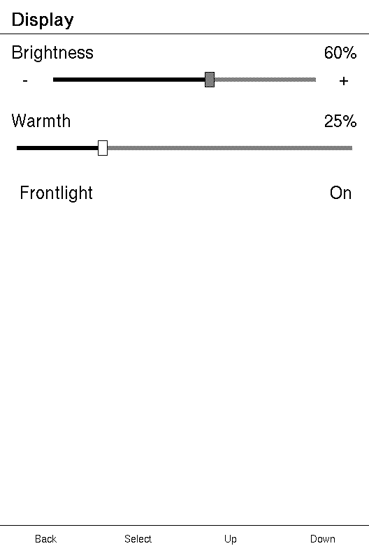
The tutorial builds a screen around a Stepper and a
Toggle from nothing. This page is what the keys do to a control, and what a
slider does.
Topics
Section titled “Topics”Slider | A horizontal slider showing value out of max. |
How a control is driven
Section titled “How a control is driven”Stateless, with regions instead of hit-testing
Section titled “Stateless, with regions instead of hit-testing”A control draws the value it is given and never changes it. The screen owns
the value and assigns it in update. No control hit-tests either: each
declares the regions it owns, and the runtime converts a touch into a value, so
no screen sees geometry. A slider's position is converted against the theme's
own knob width and track inset, the numbers the host draws with.
A control's message is built by a function pointer, fn(i32) -> M or
fn(bool) -> M, which is what an enum variant's constructor already is:
.on_change(Msg::Warmth). A function pointer costs nothing to store and
cannot capture anything, so no control borrows the screen it sits in.
Focus, and Left and Right
Section titled “Focus, and Left and Right”Up and Down walk the focus stops in tree order, wrapping at both ends. A
Slider given on_change, a Stepper given on_change or on_step, and a
Toggle given on_change are each one stop. An IconToggle never is.
Left and Right nudge whatever holds focus, by one step. A slider sends its
own value plus or minus one, held inside 0..=max. So does a stepper given only
on_change. A stepper given on_step sends -1 or +1 through it instead, and
the screen adds it. When what holds focus does not
adjust, Left and Right walk the focus instead, so a screen with no slider has
no dead keys.
Confirm never fires an adjustable control. On a device with a Left/Right
pair it does nothing to one: the pair is the way in. On a device without one,
Confirm opens the control, as below. On a Toggle, which does not adjust,
Confirm sends the same message a tap sends.
The value mode
Section titled “The value mode”On a device without the pair, the keys that walk the list are also the only keys that could move a value. So Confirm opens a slider or a stepper, and until it closes those keys mean something else.
| Key, while open | Does |
|---|---|
| Up, PageBack | raises the value by one |
| Down, PageForward | lowers it by one |
| Left, Right | lowers or raises it by one, from a host that sends them anyway |
| Confirm | closes, and dispatches one message carrying the value shown |
| Back | closes, dispatches nothing, and stays on the screen |
The framework holds the value while it is open. The keys move a copy the
screen never sees, held inside 0..=max; the control paints from that copy.
Confirm sends it once, through Slider::on_change or Stepper::on_change, so a
screen that saves every change writes once per edit. Back drops the copy, which
leaves the screen exactly as it was, whether it clamps, scales a step or
neither. Touches and swipes are ignored while a value is open, so a finger
cannot move the value or the focus out from under the keys. Screen::on_key is
still asked first.
The panel shows the mode. A control is drawn idle, focused, or open, and what each looks like is the backend's choice. The runtime also takes over two button hints:
| While | Back's slot | Confirm's slot |
|---|---|---|
| a control that can open holds focus, on a device without the pair | the screen's own | the host's word for Edit |
| a control is open | the host's word for Cancel | the host's word for Done |
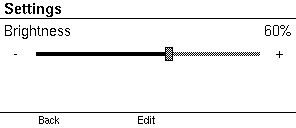
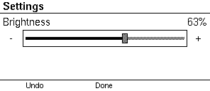
A control opens only if the framework can commit what the edit reaches. A
Slider with on_change always can, and so can a Stepper with on_change.
One with only on_step cannot, because a step is worth whatever the screen
makes of it and cannot say "the value is 63 now". Inside an edit a step is one unit of the control's
range, whatever on_step is worth outside one.
Example — one write per edit, on a device without the pair
use xpui::screen::{Driver, Runtime};use xpui::{Button, NavigationScreen, Screen, Slider, View, testing};
#[derive(Clone, Copy)]enum Msg {  Warmth(i32),}
struct Warmth {  warmth: i32,  writes: usize, // a screen that saves on every change}
impl Screen for Warmth {  type Message = Msg;
  fn body(&self) -> impl View<Msg> {    NavigationScreen::new(      Slider::new(self.warmth, 100)        .on_change(Msg::Warmth)        .title("Warmth")        .readout("%"),    )  }
  fn update(&mut self, message: Msg) {    let Msg::Warmth(value) = message;    self.warmth = value.clamp(0, 100);    self.writes += 1;  }
  fn title(&self) -> Option<&'static str> {    Some("Warmth")  }}
testing::install();testing::reset();testing::set_has_left_right_keys(false);
let mut runtime = Runtime::new(Warmth { warmth: 25, writes: 0 });runtime.render();
// Confirm opens the slider; Up moves the framework's copy, not the screen's.for key in [Button::Confirm, Button::Up, Button::Up, Button::Up] {  testing::press(key);  runtime.loop_();}assert_eq!(runtime.screen().warmth, 25);
// Back cancels: nothing is sent, and the screen does not finish.testing::press(Button::Back);runtime.loop_();assert_eq!(runtime.screen().writes, 0);assert_eq!(testing::finishes(), 0);
// Open, move, Confirm: one message, carrying what the panel showed.for key in [Button::Confirm, Button::Up, Button::Up, Button::Confirm] {  testing::press(key);  runtime.loop_();}assert_eq!(runtime.screen().warmth, 27);assert_eq!(runtime.screen().writes, 1);
Example — the same screen on a device with the pair
use xpui::screen::{Driver, Runtime};use xpui::{Button, testing};
testing::install();testing::reset();testing::set_has_left_right_keys(true);
let mut runtime = Runtime::new(Warmth { warmth: 25, writes: 0 });runtime.render();
// Right nudges at once, and each nudge is a message.testing::press(Button::Right);runtime.loop_();assert_eq!((runtime.screen().warmth, runtime.screen().writes), (26, 1));
// Confirm opens nothing here: Up walks the focus, and the value stays put.for key in [Button::Confirm, Button::Up] {  testing::press(key);  runtime.loop_();}assert_eq!((runtime.screen().warmth, runtime.screen().writes), (26, 1));
The value a control shows
Section titled “The value a control shows”A value control carries its own name and number. .title and .readout
draw both on one line above the track, the name at the leading edge and the
number at the trailing one. That line is as tall as the interface font plus
the theme's small spacing step, and the control grows by it.
Do not paint that line yourself. A number a screen builds in update cannot
move while an edit is open, because the framework holds the value and does not
tell the screen, so the track would slide under a number that stands still. The
control's own number is drawn from the edit's copy. It is also formatted into a
buffer on the stack rather than with format!, which in body() would
allocate on every frame.
- A drag reaches only a track. A slider's track takes every frame the finger is down, and follows it. Everything else acts once, on release, so a finger resting on a glyph does not re-fire it. The release that ends a drag is swallowed rather than read as a tap.
- A tap on a track jumps to the value under the finger.
- A control smaller than a fingertip is widened, to the theme's minimum
touch target, centred on what was drawn. A stepper's
-and+rely on it. - A held key repeats: a nudge fires on the press, then again every 500 ms after a 500 ms delay. On a panel whose refresh blocks the loop for longer than that, the hold re-arms instead, so the next repeat waits the refresh plus the delay, and a press released during a refresh moves a value once.
Slider
Section titled “Slider”A horizontal slider showing value out of max.
pub struct Slider<M>
A slider is as wide as it is offered, and one themed list row tall, never shorter than the knob the host draws, plus the line above it when it has one. It lines up with list rows beside it. The host draws the track, the fill and the knob, in whichever state the keys leave it: idle, focused or open.

| Builder | Sets | When not called |
|---|---|---|
on_change | the message; makes the slider a focus stop and a touch target | display-only: never focused, never touched |
title | the name on the line above | no name |
readout | the number on the line above, with its unit | no number |
without_focus | drops the focus stop, keeping touch | a focus stop |
The focus stop covers the whole control, line included, so a slider scrolled into view by the keys brings its name and number with it. The touch target is the track alone, so a finger on the name sets nothing.
Example — a plain track

use xpui::{NavigationScreen, Screen, Slider, View};
#[derive(Clone, Copy)]enum Msg {  Warmth(i32), // the new value, from a drag, a tap or a key}
struct Warmth {  warmth: i32,}
impl Screen for Warmth {  type Message = Msg;
  fn body(&self) -> impl View<Msg> {    NavigationScreen::new(Slider::new(self.warmth, 100).on_change(Msg::Warmth))  }
  fn update(&mut self, message: Msg) {    match message {      Msg::Warmth(value) => self.warmth = value.clamp(0, 100),    }  }
  fn title(&self) -> Option<&'static str> {    Some("Warmth")  }}
let mut screen = Warmth { warmth: 40 };screen.update(Msg::Warmth(41));assert_eq!(screen.warmth, 41);
Example — a name and a number
use xpui::{NavigationScreen, Screen, Slider, View};
#[derive(Clone, Copy)]enum Msg {  Warmth(i32),}
struct Display {  warmth: i32,}
impl Screen for Display {  type Message = Msg;
  fn body(&self) -> impl View<Msg> {    NavigationScreen::new(      Slider::new(self.warmth, 100)        .on_change(Msg::Warmth)        .title("Warmth")        .readout("%"),    )  }
  fn update(&mut self, message: Msg) {    let Msg::Warmth(value) = message;    self.warmth = value.clamp(0, 100);  }
  fn title(&self) -> Option<&'static str> {    Some("Display")  }}
Example — a range that does not start at zero
A slider runs from 0, so a range of 5 to 60 minutes is an offset of 0 to 55.
use xpui::{NavigationScreen, Screen, Slider, View};
const MIN: i32 = 5;const MAX: i32 = 60;
#[derive(Clone, Copy)]enum Msg {  Sleep(i32), // an offset from MIN}
struct Sleep {  minutes: i32,}
impl Screen for Sleep {  type Message = Msg;
  fn body(&self) -> impl View<Msg> {    NavigationScreen::new(      Slider::new(self.minutes - MIN, MAX - MIN)        .on_change(Msg::Sleep)        .title("Sleep after"),    )  }
  fn update(&mut self, message: Msg) {    let Msg::Sleep(offset) = message;    self.minutes = MIN + offset.clamp(0, MAX - MIN);  }
  fn title(&self) -> Option<&'static str> {    Some("Power")  }}
let mut screen = Sleep { minutes: 15 };screen.update(Msg::Sleep(0));assert_eq!(screen.minutes, MIN);Creating a slider
Section titled “Creating a slider”Slider::new
Section titled “Slider::new”A slider at value of max.
pub fn new(value: i32, max: i32) -> Self| Parameter | Meaning |
|---|---|
value | What it reads now: the screen's own value, rebuilt every frame. |
max | The right-hand end. The left is always 0. |
A max of zero or less draws no track rather than dividing by zero; a title
and a readout still draw.
Slider::percent
Section titled “Slider::percent”A slider at percent of the way along.
pub fn percent(percent: i32) -> SelfSlider::new(percent, 100), with percent clamped to 0..=100 first.
Responding to input
Section titled “Responding to input”Slider::on_change
Section titled “Slider::on_change”Reports drags, taps and key nudges by building a message from the new value.
pub fn on_change(self, make: fn(i32) -> M) -> Self| Parameter | Meaning |
|---|---|
make | Builds the message from an absolute value in 0..=max. Usually a variant constructor, Msg::Warmth. |
It fires for a tap on the track, every held frame of a drag, a Left or Right nudge, and the Confirm that closes an edit. It is also what makes the slider a focus stop and a touch target: without it, a slider is a read-out.
The value is clamped for a nudge and an edit, and converted from a position for
a touch, so it is always in range. Clamping it again in update costs nothing
and survives a change of range.
Slider::without_focus
Section titled “Slider::without_focus”Drops this slider's focus stop, for a track inside a larger control that owns the stop itself — and with it, being nudged by key.
pub fn without_focus(self) -> SelfA Stepper is one focus stop and three touch targets, and its
track is a slider built with this; otherwise Up and Down would stop twice on
one row. The track still drags and takes a tap, and paints itself focused and
open when the control around it is.
A control of your own that wraps a track declares the focus stop itself, and
tells the track through Interactions::set_parent_focused. See
reporting a value.
Example — a track only a finger reaches
use xpui::{HStack, IconRef, IconToggle, Modifiers, Slider, hstack};
#[derive(Clone, Copy)]enum Msg {  Light(bool),  Brightness(i32),}
let (light, brightness) = (true, 60);// Neither is a focus stop, so Up and Down pass this row by.let strip: HStack<Msg> = hstack![8;  IconToggle::new(Glyph::Sun, light).on_change(Msg::Light),  Slider::new(brightness, 100).on_change(Msg::Brightness).without_focus().flexible(),];
The line above the track
Section titled “The line above the track”Slider::title
Section titled “Slider::title”Names the control on the same line as its number.
pub fn title(self, title: impl Into<String>) -> SelfThe name sits at the leading edge. It belongs to the control rather than the screen for the same reason the number does: see the value a control shows.
Slider::readout
Section titled “Slider::readout”Draws the value as a number on a line above the track, at its trailing edge — beside title when there is one.
pub fn readout(self, suffix: &'static str) -> Self| Parameter | Meaning |
|---|---|
suffix | Appended as given: "%", "px", or "" for a bare number. |
This is the only number that moves while an edit is open. It is drawn from the framework's copy, where a number the screen painted would stand still.
The number is right-aligned, so its last digit does not move as the value crosses a power of ten. It shares a 16-byte buffer with the suffix. A suffix of five bytes or fewer always fits; a longer one, next to a number wide enough, loses whole characters from its end, never a digit.
See also: Stepper, the value mode