

Painting
The five themed components xpui asks a backend to paint around and inside a
screen's content — a header, a group heading, a slider, a progress bar and a
button-hint bar — each a plain function a backend can call itself. They paint
from drawing primitives alone. The list, the dialog and the scroll indicator are
on painting lists.
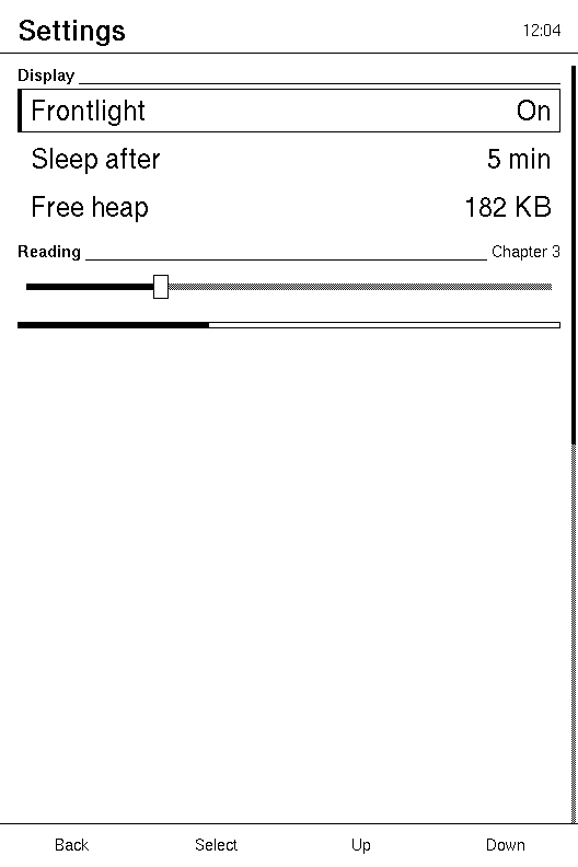
What xpui asks for | What paints it |
|---|---|
draw_slider | a dithered track, a fill, and a knob carrying the control's state: paper when idle, dithered once the keys are on it, with the whole control outlined as well when it is open |
draw_progress_bar | an outline and a proportional fill |
draw_header | a title band and its rule |
draw_sub_header | a group heading with a trailing rule |
draw_button_hints | one slot per key along the bottom, each word over the key it names |
They paint through the installed host, like a widget does, not through a
&self parameter. So each paints through whichever backend is installed, which
is the one that called it, and nothing here needs to know what that is. Every
example on this page installs xpui's recording fake, a 480x800 panel, and
reads back what was drawn.
Plain chrome wires all of these into a backend in one macro. The host contract is the trait they answer.
Topics
Section titled “Topics”draw_header | The title band, with a rule under it. |
draw_sub_header | A group heading: the label, and a rule across the rest of the line. |
draw_slider | Track, fill and knob — and, when the keys are on it, the knob says so. |
draw_progress_bar | A determinate bar: an outline, filled up to current. |
draw_button_hints | The hints along the bottom, one per key the device says it has. |
draw_header
Section titled “draw_header”The title band, with a rule under it.
pub fn draw_header(metrics: &Metrics, title: Option<&str>, subtitle: Option<&str>)
| Parameter | Meaning |
|---|---|
metrics | The band sits top_padding from the top and is header_height tall; the text is inset by content_side_padding. |
title | Drawn bold, left-aligned and centred in the band. None draws no title. |
subtitle | Drawn in the small face, right-aligned. None draws none. |
The band spans the panel's width, and the rule under it is what separates the header from content on a panel with no colour to separate them with. Text too long for its room is cut at a whole character and ends in an ellipsis.
The subtitle is drawn first and never takes more than half the band, so a long
one is cut rather than pushing the title off the panel. The title gets what is
left, less vertical_spacing.
Example — a title
use xpui::testing::{self, DrawOp};use xpui::Point;use xpui_chrome::{Metrics, draw_header};
draw_header(&Metrics::DEFAULT, Some("Settings"), None);
let text = testing::drawn_text();assert_eq!(text.len(), 1);assert_eq!((text[0].0, text[0].2.as_str()), (16, "Settings"));// The rule, along the band's lower edge.assert!(testing::ops_log().contains(&DrawOp::Line {  from: Point::new(0, 48),  to: Point::new(479, 48),}));
Example — a subtitle too long for the band
use xpui::testing;use xpui_chrome::{Metrics, draw_header};
let long = "Synchronising with the library on the other side of the house";draw_header(&Metrics::DEFAULT, Some("Settings"), Some(long));
let text = testing::drawn_text();let words: Vec<&str> = text.iter().map(|(_, _, word, _, _)| word.as_str()).collect();assert!(words.contains(&"Settings"), "the title survives: {words:?}");assert!(words.contains(&"…"), "and the subtitle is cut");
See also: draw_sub_header, Metrics::content_top
draw_sub_header
Section titled “draw_sub_header”A group heading: the label, and a rule across the rest of the line.
pub fn draw_sub_header(metrics: &Metrics, rect: Rect, label: &str, right: Option<&str>)
| Parameter | Meaning |
|---|---|
metrics | spacing_small is the gap between the label, the rule and the right-hand text. |
rect | Where the heading goes. The text is drawn from its top; the rule runs along its last row of pixels. |
label | Drawn in the small face, bold. |
right | Drawn in the small face at the right end, never taking more than half of rect. None lets the rule run to the end. |
The rule starts after the label and runs to the right-hand text or the end of
rect, which is what makes a heading read as a divider rather than as a row.
How tall the rect should be is ThemeMetric::SubHeaderHeight, which
Metrics::metric answers with
sub_header_height or the small face's line height, whichever is larger.
Example — a heading with a count
use xpui::testing::{self, DrawOp};use xpui::{Point, Rect};use xpui_chrome::{Metrics, draw_sub_header};
draw_sub_header(&Metrics::DEFAULT, Rect::new(16, 60, 448, 17), "Display", Some("3 items"));
let text = testing::drawn_text();let placed: Vec<(i32, &str)> = text.iter().map(|(x, _, word, _, _)| (*x, word.as_str())).collect();// The fake's small face is 5 pixels a character.assert_eq!(placed, [(429, "3 items"), (16, "Display")]);assert!(testing::ops_log().contains(&DrawOp::Line {  from: Point::new(55, 76),  to: Point::new(424, 76),}));
See also: draw_header, draw_list
draw_slider
Section titled “draw_slider”Track, fill and knob — and, when the keys are on it, the knob says so.
pub fn draw_slider(metrics: &Metrics, rect: Rect, value: i32, max: i32, state: ControlState)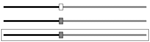
| Parameter | Meaning |
|---|---|
metrics | slider_side_inset, slider_track_height, slider_knob_width and slider_knob_height. |
rect | The whole control. The track runs across its middle, inset at each end. |
value | Where the knob sits, clamped to 0..=max. |
max | The value at the right end. 0 or less draws nothing: no range, no position to show. |
state | What the keys will do to it next, one of the three ControlStates below. |
The track is dithered rather than solid, because on one bit a solid track is indistinguishable from the filled part of it. The fill runs to the knob's centre.
The knob carries the focus mark, not the track. Three states have to be told apart on one bit of colour, and the knob is the one part still painted paper:
| State | The knob | The control |
|---|---|---|
Idle | paper, outlined | as it is |
Focused | dithered, outlined | as it is |
Editing | dithered, outlined | outlined as well |
The knob's shade already says the keys are here; the outline around an open control says they are moving the value. On a device with no Left/Right pair that outline is the only sign that Previous and Next now move the value. design.md says why no other mark would do.
The knob's position uses the same numbers xpui converts a touch to a value
with, slider_side_inset and slider_knob_width, so the two agree. It stays
inside rect even when rect is narrower or shorter than the knob.
Example — each state
use xpui::host::ControlState;use xpui::testing::{self, RectKind};use xpui::Rect;use xpui_chrome::{Metrics, draw_slider};
let rect = Rect::new(16, 100, 448, 40);
testing::reset();draw_slider(&Metrics::DEFAULT, rect, 25, 100, ControlState::Idle);assert_eq!(  testing::drawn_rects(),  [    (24, 117, 432, 6, RectKind::Dither),  // the track    (24, 117, 111, 6, RectKind::Filled),  // the fill, to the knob's centre    (128, 109, 14, 22, RectKind::Filled), // the knob, cleared to paper    (128, 109, 14, 22, RectKind::Stroked),  ]);
testing::reset();draw_slider(&Metrics::DEFAULT, rect, 25, 100, ControlState::Editing);let rects = testing::drawn_rects();assert_eq!(rects[2], (128, 109, 14, 22, RectKind::Dither));assert_eq!(rects.last(), Some(&(16, 100, 448, 40, RectKind::Stroked)));
Example — no range
use xpui::host::ControlState;use xpui::testing;use xpui::Rect;use xpui_chrome::{Metrics, draw_slider};
draw_slider(&Metrics::DEFAULT, Rect::new(16, 100, 448, 40), 5, 0, ControlState::Focused);assert!(testing::ops_log().is_empty());
See also: draw_progress_bar, Metrics::slider_knob_width
draw_progress_bar
Section titled “draw_progress_bar”A determinate bar: an outline, filled up to current.
pub fn draw_progress_bar(_metrics: &Metrics, rect: Rect, current: u32, total: u32)
| Parameter | Meaning |
|---|---|
_metrics | Not read: the bar is as tall as rect. ThemeMetric::ProgressBarHeight is how xpui asks how tall to make it. |
rect | The bar, outline included. |
current | How far along, clamped to total. |
total | The whole. 0 draws the outline alone. |
The fill sits one pixel inside the outline, and is
(width - 2) * current / total pixels wide, rounded down. A rect two pixels
wide or less has no inside, and draws the outline alone.
Example — a quarter of the way
use xpui::testing::{self, RectKind};use xpui::Rect;use xpui_chrome::{Metrics, draw_progress_bar};
draw_progress_bar(&Metrics::DEFAULT, Rect::new(16, 100, 202, 6), 85, 340);assert_eq!(  testing::drawn_rects(),  [(16, 100, 202, 6, RectKind::Stroked), (17, 101, 50, 4, RectKind::Filled)]);
Example — nothing to measure against
use xpui::testing::{self, RectKind};use xpui::Rect;use xpui_chrome::{Metrics, draw_progress_bar};
draw_progress_bar(&Metrics::DEFAULT, Rect::new(16, 100, 202, 6), 12, 0);assert_eq!(testing::drawn_rects(), [(16, 100, 202, 6, RectKind::Stroked)]);
See also: draw_slider
draw_button_hints
Section titled “draw_button_hints”The hints along the bottom, one per key the device says it has.
pub fn draw_button_hints( metrics: &Metrics, labels: &Labels, keys: &KeyRow, back: &Hint, confirm: &Hint, previous: &Hint, next: &Hint,)
| Parameter | Meaning |
|---|---|
metrics | The band is button_hints_height tall along the bottom of the panel. 0 or less draws nothing. |
labels | The words a Hint that is not text resolves to. See Labels. |
keys | The device's key row, left to right: how many slots, and which job each has. See KeyRow. |
back, confirm, previous, next | What the screen says about each key, by meaning. |
Three things, because three parties own them: the band's size is the caller's
Metrics, the words are its Labels, and which word sits over which key is the
device's KeyRow.
The band is divided by the keys the device has, the length of its row. Each
slot is labelled for its key's job, never its position: a row that puts Confirm
first gets Confirm's hint first, and a row that omits Back does not shift Back's
hint onto Confirm's key. A slot whose key is RowKey::Unassigned, and a job the
row has no key for, stay blank, because naming a key the device does not have
sends a person looking for it.

What each hint draws:
Hint | Draws |
|---|---|
Standard | the slot's own word from labels.standard_hints: back, confirm, previous, next |
Edit | labels.mode_hints[0] |
Done | labels.mode_hints[1] |
Cancel | labels.mode_hints[2] |
Text(label) | label, as the screen gave it |
None | nothing: the slot is blank |
Each word is centred in its slot in the small face, and cut with an ellipsis
when it does not fit. A rule above the band matches the one under the header.
A device whose keys are not a row along the bottom reserves no band, and
Metrics::without_button_hints
is how its metrics say so.

Example — a reader's four keys
use xpui::host::{Hint, KeyRow};use xpui::testing;use xpui_chrome::{Labels, Metrics, draw_button_hints};
let standard = Hint::Standard;draw_button_hints(&Metrics::DEFAULT, &Labels::ENGLISH, &KeyRow::READER, &standard, &standard, &standard, &standard);
// Four 120-pixel slots across 480, each word centred; the small face is 5 pixels a character.let text = testing::drawn_text();let placed: Vec<(i32, &str)> = text.iter().map(|(x, _, word, _, _)| (*x, word.as_str())).collect();assert_eq!(placed, [(50, "Back"), (165, "Select"), (295, "Up"), (410, "Down")]);
Example — a value control is open
use xpui::host::{Hint, KeyRow};use xpui::testing;use xpui_chrome::{Labels, Metrics, draw_button_hints};
draw_button_hints(  &Metrics::DEFAULT,  &Labels::ENGLISH,  &KeyRow::READER,  &Hint::Cancel,  &Hint::Done,  &Hint::None,  &Hint::text("Undo"),);
let text = testing::drawn_text();let words: Vec<&str> = text.iter().map(|(_, _, word, _, _)| word.as_str()).collect();assert_eq!(words, ["Cancel", "Done", "Undo"]);
Example — a row of three, Confirm first
use xpui::host::{Hint, KeyRow, RowKey};use xpui::testing;use xpui_chrome::{Labels, Metrics, draw_button_hints};
const BADGE: KeyRow = KeyRow::new(&[RowKey::Confirm, RowKey::Back, RowKey::Unassigned]);
let standard = Hint::Standard;draw_button_hints(&Metrics::DEFAULT, &Labels::ENGLISH_NARROW, &BADGE, &standard, &standard, &standard, &standard);
// Three 160-pixel slots: OK over the first key, Back over the second, and no// slot for Previous or Next.let text = testing::drawn_text();let placed: Vec<(i32, &str)> = text.iter().map(|(x, _, word, _, _)| (*x, word.as_str())).collect();assert_eq!(placed, [(75, "OK"), (230, "Back")]);
Example — no band
use xpui::host::{Hint, KeyRow};use xpui::testing;use xpui_chrome::{Labels, Metrics, draw_button_hints};
let touch = Metrics::DEFAULT.without_button_hints();let standard = Hint::Standard;draw_button_hints(&touch, &Labels::ENGLISH, &KeyRow::READER, &standard, &standard, &standard, &standard);assert!(testing::ops_log().is_empty());
See also: Labels, KeyRow, plain_chrome!