

Lists
Rows of settings and read-outs drawn by the host's theme, and the two pieces that group a screen around them. The theme owns a row's height, its highlight and its type, so a list built here looks exactly like the device's own.
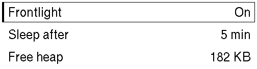
A second screen builds a list, navigation and scrolling from nothing. This page is what each piece does.
Topics
Section titled “Topics”List | A themed, selectable list filling the space it is given. |
ListRow | One row: a title, and optionally a subtitle beneath it and a value on the right. |
list! | A themed list. |
Section | A heading with content beneath it, for splitting a screen into groups. |
Divider | A one-pixel line spanning the width it is given, for separating sections. |
A themed, selectable list filling the space it is given.
pub struct List<M>M is the screen's message type: what a row sends when it is tapped.
| Builder | Sets | When not called |
|---|---|---|
push · extend | the rows, in order | no rows |
selected | the row highlighted while none holds focus | nothing highlighted |
Focus is the framework's. A row that carries a message
(ListRow::on_tap) is a focus stop, in the order the rows
read. Up and Down walk them; Confirm sends the focused row's message, which is
the same message a tap on that row sends. The list highlights whichever row
holds focus, and the screen writes no code for any of it. A row without a
message is a read-out: drawn, and never focused.
A list is as tall as its rows, capped by the height it is offered, so
several lists can share one screen, one per Section. Rows that do
not fit are neither drawn nor focusable. Put a list longer than the panel in a
ScrollView, which keeps the focused row in sight.
Example — a settings screen
use xpui::{List, ListRow, NavigationScreen, Screen, View};
#[derive(Clone, Copy)]enum Msg {  Frontlight(bool), // the state the row moves to  Sleep,}
struct Settings {  frontlight: bool,}
impl Screen for Settings {  type Message = Msg;
  fn body(&self) -> impl View<Msg> {    NavigationScreen::new(      List::new()        .push(          ListRow::toggle("Frontlight", self.frontlight, "On", "Off")            .on_tap(Msg::Frontlight(!self.frontlight)),        )        .push(ListRow::new("Sleep after").value("5 min").on_tap(Msg::Sleep))        .push(ListRow::new("Free heap").value("182 KB")), // a read-out    )  }
  fn update(&mut self, message: Msg) {    match message {      Msg::Frontlight(on) => self.frontlight = on,      Msg::Sleep => {}    }  }
  fn title(&self) -> Option<&'static str> {    Some("Settings")  }}
Example — rows built from data
use xpui::{List, ListRow};
let networks = ["Home", "Office", "Library"];let list: List<usize> = List::new().extend(  networks    .iter()    .enumerate()    .map(|(index, name)| ListRow::new(*name).on_tap(index)),);assert_eq!(list.len(), 3);
Creating a list
Section titled “Creating a list”List::new
Section titled “List::new”An empty list with nothing selected.
pub fn new() -> SelfList is also Default.
Adding rows
Section titled “Adding rows”List::push
Section titled “List::push”Adds a row at the end.
pub fn push(self, row: ListRow<M>) -> SelfList::extend
Section titled “List::extend”Adds every row of rows, in order.
pub fn extend(self, rows: impl IntoIterator<Item = ListRow<M>>) -> SelfHighlighting
Section titled “Highlighting”List::selected
Section titled “List::selected”Highlights a row whenever none of the list's rows holds focus.
pub fn selected(self, index: usize) -> Self| Parameter | Meaning |
|---|---|
index | Zero-based. An index past the last row highlights nothing. |
A list whose rows carry messages is highlighted by whichever row holds focus, and focus wins. This is for rows nothing focuses: a list of read-outs, or a list while focus is on a control beside it.
Reading a list
Section titled “Reading a list”List::len
Section titled “List::len”How many rows it holds.
pub fn len(&self) -> usizeList::is_empty
Section titled “List::is_empty”Whether it holds no rows.
pub fn is_empty(&self) -> boolSee also: ListRow, list!, Section
ListRow
Section titled “ListRow”One row: a title, and optionally a subtitle beneath it and a value on the right.
pub struct ListRow<M>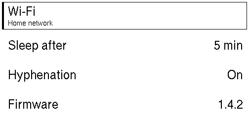
A row is not a view by itself: it exists to go in a List, which
measures it and has the theme draw it. Its strings are converted once, when the
row is built, not on every frame. What happens to text too long for the row is
the theme's decision.
| Builder | Sets | When not called |
|---|---|---|
ListRow::new | the title | — |
subtitle | a second line under the title | one line |
value | right-aligned text | no value |
on_tap | the message, which makes the row a focus stop | a read-out, never focused |
Example — every shape of row
use xpui::{List, ListRow};
#[derive(Clone, Copy)]enum Msg {  Network,  Sleep,  Hyphenation(bool),}
let hyphenation = true;let list: List<Msg> = List::new()  .push(ListRow::new("Wi-Fi").subtitle("Home network").on_tap(Msg::Network))  .push(ListRow::new("Sleep after").value("5 min").on_tap(Msg::Sleep))  .push(ListRow::toggle("Hyphenation", hyphenation, "On", "Off").on_tap(Msg::Hyphenation(!hyphenation)))  .push(ListRow::new("Firmware").value("1.4.2"));assert_eq!(list.len(), 4);
Creating a row
Section titled “Creating a row”ListRow::new
Section titled “ListRow::new”A one-line row reading title, with no message.
pub fn new(title: impl Into<String>) -> SelfListRow::toggle
Section titled “ListRow::toggle”A boolean setting: a row whose value reads as one of two words.
pub fn toggle(title: impl Into<String>, on: bool, on_label: impl Into<String>, off_label: impl Into<String>) -> Self| Parameter | Meaning |
|---|---|
title | What the setting is called. |
on | Its current state. |
on_label | The value shown while on is true: "On", "Show". |
off_label | The value shown while it is false: "Off", "Hide". |
The theme draws no switch graphic: the row reads one word or the other, and the focus marker shows which row the keys are on. The caller supplies both words because they differ from setting to setting and only the caller can translate them.
The row does not flip itself. Give it a message carrying the state it moves
to, .on_tap(Msg::Hyphenation(!on)), and assign that in update. A message
that only says "toggle" undoes itself if it is applied twice.
Toggle works the next state out for you.
Content
Section titled “Content”ListRow::subtitle
Section titled “ListRow::subtitle”Secondary text below the title.
pub fn subtitle(self, subtitle: impl Into<String>) -> SelfEvery row in the list gets taller when any row has one.
ListRow::value
Section titled “ListRow::value”Right-aligned text, for the current setting of an option row.
pub fn value(self, value: impl Into<String>) -> SelfInteraction
Section titled “Interaction”ListRow::on_tap
Section titled “ListRow::on_tap”Makes the row interactive: tapping it, or focusing it and pressing Confirm, sends message.
pub fn on_tap(self, message: M) -> SelfA row without a message is a read-out, and never takes focus. The message is cloned each time it is sent, so it is a value, never a closure.
Reading a row
Section titled “Reading a row”ListRow::value_text
Section titled “ListRow::value_text”The right-hand value as text, if the row has one.
pub fn value_text(&self) -> Option<&str>Mainly for tests: the theme reads a row's fields for itself.
A themed list.
macro_rules! listlist![selected; row, row, …]list![selected]Shorthand for a list whose rows are fixed: it expands to
List::new().selected(selected) followed by one .push(row) per row, and
hides nothing. selected is always given, and applies only while no row holds
focus; see List::selected.
use xpui::{List, ListRow, list};
let selected = 0;let list: List<()> = list![selected;  ListRow::new("Wi-Fi").value("On"),  ListRow::new("Bluetooth").value("Off"),];assert_eq!(list.len(), 2);
Section
Section titled “Section”A heading with content beneath it, for splitting a screen into groups.
pub struct Section<M>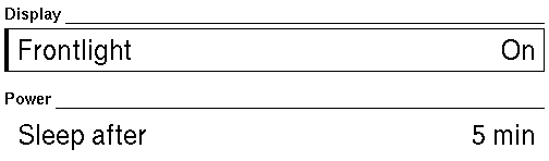
The heading is drawn by the theme's own sub-header, so it matches the host's
headings rather than being a bold Text that looks
similar. Between the heading and its content is the theme's small spacing
step. The space between one section and the next is the stack's own, so a
heading sits closer to what it heads than to the group above.
The content may be any view. It is usually a List.
Example — a screen in two groups
use xpui::{List, ListRow, Section, VStack, vstack};
#[derive(Clone, Copy)]enum Msg {  Frontlight,  Sleep,}
let screen: VStack<Msg> = vstack![16;  Section::new("Display", List::new().push(ListRow::new("Frontlight").value("On").on_tap(Msg::Frontlight))),  Section::new("Power", List::new().push(ListRow::new("Sleep after").value("5 min").on_tap(Msg::Sleep))),];
Creating a section
Section titled “Creating a section”Section::new
Section titled “Section::new”content under a heading reading title.
pub fn new(title: impl Into<String>, content: impl View<M> + 'static) -> SelfDivider
Section titled “Divider”A one-pixel line spanning the width it is given, for separating sections.
pub struct Divider
A divider is one pixel tall and as wide as its parent offers. It carries no
message type of its own, so it sits in any stack, and it is Default.
use xpui::{Divider, Text, VStack, vstack};
let group: VStack<()> = vstack![8; Text::new("Wi-Fi"), Divider::new(), Text::new("Bluetooth")];
Creating a divider
Section titled “Creating a divider”Divider::new
Section titled “Divider::new”A rule across the width it is given.
pub fn new() -> SelfSee also: Section