

Indicators
What a screen shows about progress without asking anything back. An indicator takes no input and holds no state: the screen passes the numbers in every frame, and the host's theme draws them, so a bar here matches the device's own.
Topics
Section titled “Topics”ProgressBar | Shows current out of total, drawn by the theme so it matches the host's own. |
ProgressBar
Section titled “ProgressBar”Shows current out of total, drawn by the theme so it matches the host's own.
pub struct ProgressBar
A bar spans the width it is offered. Its height is the theme's progress bar
height unless height overrides it. The host draws the
frame and the fill.
It sends no message and is never a focus stop. It carries no message type of its own, so it sits in any stack. Measured on its own, name the message type, as the last example does.
| Builder | Sets | When not called |
|---|---|---|
height | the bar's height, in pixels | the theme's ProgressBarHeight |
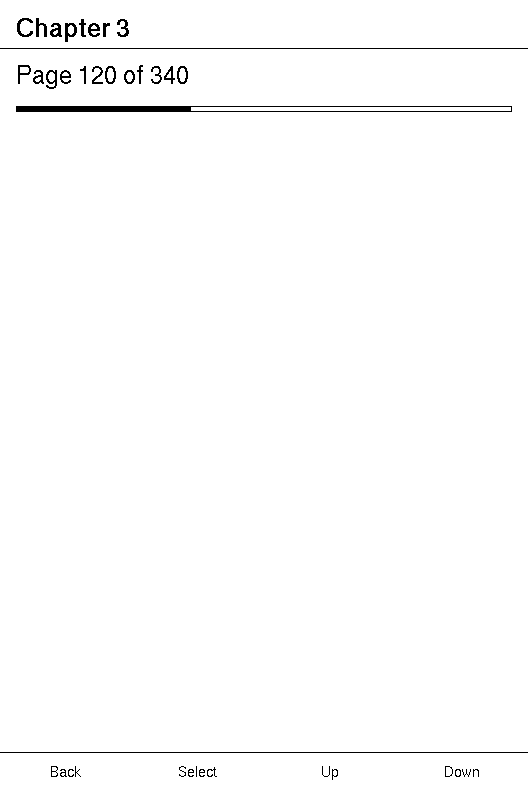
Example — reading progress
use xpui::{NavigationScreen, ProgressBar, Screen, Text, View, vstack};
struct Chapter {  page: u32,  pages: u32,  // Built in `update`, when the page changes, never in `body`.  label: String,}
#[derive(Clone, Copy)]enum Msg {  NextPage,}
impl Screen for Chapter {  type Message = Msg;
  fn body(&self) -> impl View<Msg> {    NavigationScreen::new(vstack![16;      Text::new(self.label.clone()),      ProgressBar::new(self.page, self.pages),    ])  }
  fn update(&mut self, message: Msg) {    match message {      Msg::NextPage => {        self.page = (self.page + 1).min(self.pages);        self.label = format!("Page {} of {}", self.page, self.pages);      }    }  }
  fn title(&self) -> Option<&'static str> {    Some("Chapter 3")  }}
let mut screen = Chapter { page: 119, pages: 340, label: String::new() };screen.update(Msg::NextPage);assert_eq!(screen.label, "Page 120 of 340");
Example — a download in percent
use xpui::{ProgressBar, Text, VStack, vstack};
#[derive(Clone, Copy)]enum Msg {}
let downloaded = 72;let status: VStack<Msg> = vstack![8;  Text::new("Downloading"),  ProgressBar::percent(downloaded),];
Example — a heavier bar
use xpui::{ProgressBar, Size, View};
xpui::testing::install();let mut bar = ProgressBar::percent(72).height(16);View::<()>::measure(&mut bar, Size::new(480, 800));assert_eq!(View::<()>::size(&bar), Size::new(480, 16));
Creating a bar
Section titled “Creating a bar”ProgressBar::new
Section titled “ProgressBar::new”A bar at current out of total.
pub fn new(current: u32, total: u32) -> Self| Parameter | Meaning |
|---|---|
current | How far along: a page, a byte count, a step. |
total | Where it ends. The fill is current out of this. |
A zero total draws nothing rather than dividing by zero. The bar keeps its
size, so the layout around it does not move when the total arrives.
ProgressBar::percent
Section titled “ProgressBar::percent”A bar at percent of the way along, clamped to 0-100.
pub fn percent(percent: u32) -> SelfProgressBar::new(percent, 100), with anything past 100 drawn as 100.
Sizing
Section titled “Sizing”ProgressBar::height
Section titled “ProgressBar::height”Overrides the theme's bar height.
pub fn height(self, height: i32) -> Self| Parameter | Meaning |
|---|---|
height | In pixels. The width is still whatever the bar is offered. |
Prefer the theme's height, which matches the device's own bars. Override it for a bar that is the main thing on its screen.
See also: Slider, for a bar a person can move