

Layout
The containers that put space between and around other views, and make a tree
taller than the panel reachable: a spacer, padding and a scroll view.
Containers take views by value, so a tree is built without ever writing
Box::new.
The tutorial builds a screen from these, and
a second screen adds scrolling. The stacks these sit
in are in Stacks, and the chainable wrappers, .frame, .flexible
and .on_tap, are in Modifiers. This page is what each piece
does.
Topics
Section titled “Topics”Spacer | Absorbs the space its siblings do not use, pushing whatever follows to the far end of the stack. |
Padding | Surrounds a child with empty space. |
ScrollView | Shows as much of its content as fits, and lets the rest be scrolled to. |
UNBOUNDED | The height offered to content that may be as tall as it likes. |
Spacer
Section titled “Spacer”Absorbs the space its siblings do not use, pushing whatever follows to the far end of the stack.
pub struct Spacer
A spacer draws nothing and takes no input. A stack measures it after its fixed
children, against only what they left, so a spacer never pushes content past
the edge. Several spacers in one stack share that space equally. A spacer
carries no message type, so it sits in any stack, and it is Default.
Outside a stack a spacer is as big as whatever it is offered. Across its stack it never counts: a row holding one is as tall as its other children.
Example — centring with two spacers
use xpui::{HStack, Spacer, Text, hstack};
let row: HStack<()> = hstack![0; Spacer::new(), Text::new("Page 12 of 240"), Spacer::new()];
Example — a footer
See vstack!: a spacer before the last child puts that child on
the bottom edge.
Creating a spacer
Section titled “Creating a spacer”Spacer::new
Section titled “Spacer::new”A spacer that takes whatever its stack has left.
pub fn new() -> SelfSee also: VStack, HStack, Flexible
Padding
Section titled “Padding”Surrounds a child with empty space.
pub struct Padding<M>
The child is offered what the parent offers, less the insets, and the padding is as big as the child plus the insets. It draws nothing itself, and moves the child's touch targets with it.
Padding is as flexible as its child: padding around a spacer is still a spacer.
Example — the same inset on every edge
use xpui::{Divider, Padding, Text, VStack, vstack};
let group: VStack<()> = vstack![0;  Divider::new(),  Padding::all(Text::new("Sleep after 5 min"), 12),  Divider::new(),];
Example — wide sides and a thin top and bottom

use xpui::{Divider, Padding, Text, VStack, vstack};
let group: VStack<()> = vstack![0;  Divider::new(),  Padding::symmetric(Text::new("Sleep after 5 min"), 40, 4),  Divider::new(),];
Example — one edge at a time
use xpui::{Insets, Padding, Size, Text, View};
let mut text = Text::new("Indented");View::<()>::measure(&mut text, Size::new(480, 800));let natural = View::<()>::size(&text);
let insets = Insets { top: 0, right: 0, bottom: 8, left: 24 };let mut padded: Padding<()> = Padding::new(Text::new("Indented"), insets);padded.measure(Size::new(480, 800));assert_eq!(padded.size(), Size::new(natural.width + 24, natural.height + 8));
Creating padding
Section titled “Creating padding”Padding::all
Section titled “Padding::all”The same inset on every edge.
pub fn all(child: impl View<M> + 'static, inset: i32) -> Self where M: 'static,Padding::symmetric
Section titled “Padding::symmetric”Independent horizontal and vertical insets.
pub fn symmetric(child: impl View<M> + 'static, horizontal: i32, vertical: i32) -> Self where M: 'static,| Parameter | Meaning |
|---|---|
horizontal | Pixels on the left and on the right. |
vertical | Pixels on the top and on the bottom. |
Padding::new
Section titled “Padding::new”child inset by insets.
pub fn new(child: impl View<M> + 'static, insets: Insets) -> Self where M: 'static,Insets has a public field for each edge, and Insets::all and
Insets::symmetric build the two shapes above; see
Geometry.
ScrollView
Section titled “ScrollView”Shows as much of its content as fits, and lets the rest be scrolled to.
pub struct ScrollView<M>
Wrap a screen's content in one and everything below the fold becomes reachable. The runtime owns the offset, beside focus, so a screen never tracks a scroll position:
- Moving focus scrolls by the least that brings the focused control fully into view. Reaching the first control scrolls to the very top, so a heading above it is not stranded, and reaching the last scrolls to the very bottom.
- Where focus cannot move, because nothing on the screen is focusable, Up, Down and the page keys scroll by half the view instead.
- A vertical swipe moves focus, and so scrolls only as focus does. Content with nothing focusable does not scroll by swipe.
The scroll view fills the space it is offered and measures its content against
UNBOUNDED height, so rows keep their natural size rather than
being squeezed to fit. The furthest it scrolls puts the end of the content at
the bottom of the view, never into blank space. Content is drawn under a clip
the full width of the panel, so what overflows is discarded rather than painted
over the header and the button hints, and the theme draws the scroll indicator
in the side margin. It draws nothing when the content fits.
Anything scrolled out of sight keeps its focus stop, which is how it can be reached at all, but stops taking touches: its rectangle now lies over the chrome, where a tap means something else.
Example — a long list that scrolls
use xpui::{List, ListRow, NavigationScreen, Screen, ScrollView, View};
#[derive(Clone, Copy)]enum Msg {  Open(usize),}
struct Contents {  chapters: Vec<String>, // built once, not on every frame}
impl Screen for Contents {  type Message = Msg;
  fn body(&self) -> impl View<Msg> {    NavigationScreen::new(ScrollView::new(      List::new().extend(        self.chapters          .iter()          .enumerate()          .map(|(index, title)| ListRow::new(title.as_str()).on_tap(Msg::Open(index))),      ),    ))  }
  fn update(&mut self, message: Msg) {    match message {      Msg::Open(_chapter) => {}    }  }
  fn title(&self) -> Option<&'static str> {    Some("Contents")  }}
let screen = Contents {  chapters: (1..=24).map(|n| format!("Chapter {n}")).collect(),};
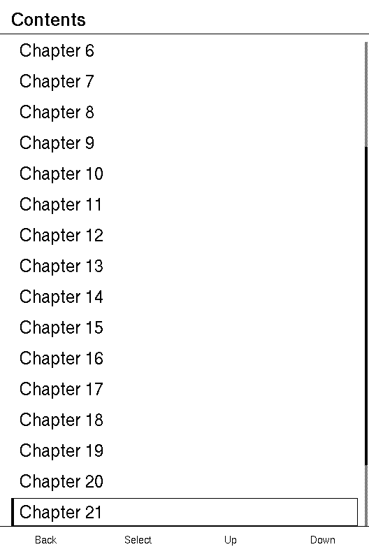
After Down is pressed twenty times, the focus is on Chapter 21 and the list has scrolled just far enough to show it:
Example — the band a scroll view occupies
use xpui::{List, ListRow, ScrollView, Size, View};
xpui::testing::install();let rows = (0..40).map(|index| ListRow::new("Setting").on_tap(index));let mut scroll = ScrollView::new(List::new().extend(rows));
View::<usize>::measure(&mut scroll, Size::new(480, 400));assert_eq!(  View::<usize>::size(&scroll),  Size::new(480, 400),  "the view occupies the band it was given, however tall its content is");
Creating a scroll view
Section titled “Creating a scroll view”ScrollView::new
Section titled “ScrollView::new”A scrolling window over content.
pub fn new(content: impl View<M> + 'static) -> SelfThe content may be any view: a List, or a
vstack! of sections.
See also: UNBOUNDED, List, NavigationScreen
UNBOUNDED
Section titled “UNBOUNDED”The height offered to content that may be as tall as it likes.
pub const UNBOUNDED: i32Sixteen million pixels, more than any real content reaches. A
ScrollView offers it to its content. A view of your own that
hosts content of any height offers it too.
It is not i32::MAX, and the difference matters. A few views echo the height
they were offered straight back, Spacer, Modal and a nested ScrollView
among them, and a stack adds that to its siblings. With i32::MAX that
overflows: a panic in a debug build, and a negative height or a scroll offset
of two billion in a release one.
use xpui::{Size, Spacer, Text, UNBOUNDED, VStack, View, vstack};
let mut column: VStack<()> = vstack![8; Text::new("Title"), Spacer::new(), Text::new("Footer")];column.measure(Size::new(480, UNBOUNDED));assert_eq!(column.size().height, UNBOUNDED, "the spacer took it all, and nothing overflowed");
See also: ScrollView